UX Design for Developers

As a web or mobile developer, you may have often wondered what is it really that the UX Designers do? How do you get hands on this magic dust that makes some companies’ products noticeably easier and fun to use? How do you build products with great usability when you don’t have the budget of hiring a UX Designer for your solo side-project?
I wrote this guide to explain what goes on in a UX Designer’s mind when they prototype products — so you can think like one too! Let’s get started.
User Goals
A user goal is what the user is trying to achieve. For freeCodeCamp, the user’s goal is to learn web programming so that they can start making web apps. For Uber’s user, the goal is to find a cab to get to a destination. For Fandango’s user, the goal is to book a movie ticket. And so on.
It’s important to identify the user’s goals before we start designing anything. What is the user’s problem we are trying to solve? What does the user want to do here? What’s the primary job the user is hiring your product for?
There are usually multiple user goals within an application: we will break each of these goals into a list of tasks that the user must accomplish to achieve their goal.

Task Lists
Once you’ve identified a user goal, you can start breaking it down into a list of tasks that the user must accomplish to complete the goal successfully. For finding an Uber, a task list would look as follows:
- Open the Uber app.
- Enter a destination in the “Where to?” box on top.
- Pick the type of Uber you want (Pool, uberX, SELECT, BLACK, uberXL, SUV, etc.)
- Make sure the Payment method is the one you desire to pay with.
- Press the Confirm button.
- Confirm the pickup spot.
- Wait for the car, take the ride, get dropped off at your destination.
- Review and tip.
Task lists look very simple at the face of it but can end up becoming complicated and confusing. For instance, Uber made a conscious decision to add a Confirm pickup spot step (Step 6) even though they can be reasonably confident that the GPS would pick your location accurately. Additionally, some tasks can be done in any order, some tasks may require other tasks to be done before them (step 7), or some tasks may even be optional (step 8).

User Flow Diagrams
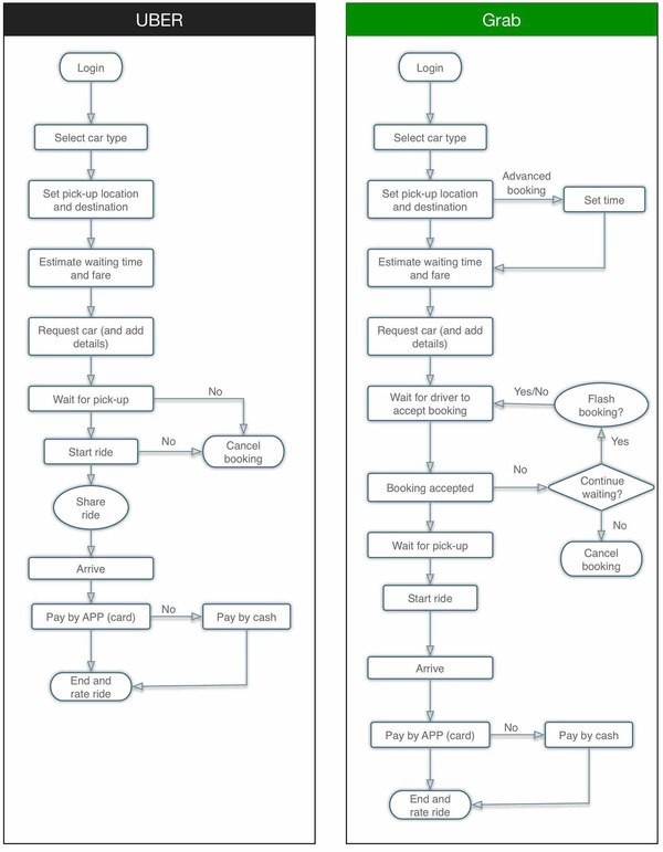
Given a task list, you can convert it into a User Flow Diagram to show how a user will move through your app. User Flow Diagrams help you reason about how the application will work before you start any prototyping/building. It’s the same as the task list, except it’s a flowchart that uses symbols and arrows to communicate the task list more visually.
Here are two User Flow diagrams comparing Uber to Grab:

Empathy Map
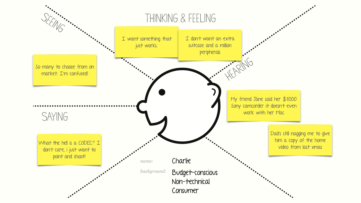
An empathy map shows you how individual users feel, think and talk about the experience of using your product. It is the beginning of creating a user persona, which we will discuss near the end of this guide.
Empathy maps are used to collect and organize data about individual users. Later, we can go back to them to look for behavioral patterns, and aggregate them eventually into user personas.
Here’s how you make an empathy map:
- Split a piece of paper into four quadrants.
- Label them Seeing, Thinking & Feeling, Hearing and Saying.
- Interview your users, and during the interview fill out these quadrants as you observe their interaction with the prototype/product, or the problem as they encounter it in a real setting.

Once you collect enough empathy maps for individual users (I recommend at least 3 to 5), you’ll start to see patterns — these patterns inform User Personas that you’ll create later.
User Journey Maps
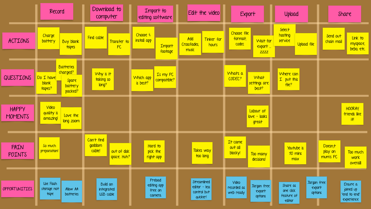
A User Journey Map is very similar in concept to an Empathy Map, except it shows how a user is feeling and what they’re thinking about at different points in time while using your product.
In essence, it’s a series of Empathy maps on a timeline as the user progresses through a user flow in your product. For example:

In the User Journey map above, you’ll notice that different stages of the experience are on the X-axis, and we are trying to identify various aspects of the user’s experience on the Y-axis.
There are two types of user journey maps:
- retrospective maps: where you map out how users currently do stuff based on research findings (like the map above)
- prospective maps: where you map how you expect users to behave with your new product idea or with your redesigned flow in an existing product.
User Personas
After creating Empathy maps and User Journey maps, the next step is to look for patterns in your observations and create a few personas for your project.
Creating User Personas
First of all, let’s nail down what personas or profiles are NOT:
- Personality types
- Demographics
- Characters in your “brand story”
- Stereotypes based on your experience
- Shallow or 1-dimensional
- Concepts
- Predictions
So what is a user persona or profile?
A user persona describes the goals, expectations, motivations, and behavior of real people. Why do they come to your site? What are they looking for? What makes them nervous? And so on.
All the information you need should be in your research and data. If you can’t back it up with research, it’s not a good sign and you should talk more to your users.
Example of a bad persona

Persona A is a female, between the ages of 35–45 with an above average income and education. They have at least one child and own at least one new vehicle. They are outgoing and career-oriented and tend to be right-brain thinkers.
Why it’s bad: That might be great if you’re selling ads, but as far as UX goes, that profile is not useful. Why? Because it doesn’t allow you to say “no” to any feature ideas. What sort of features does a female between 35–45 need? It could be anything!
Example of a useful persona:

Persona B is an experienced manager, mostly interested in one or two areas of expertise. They visit often, but they are pressed for time, so they focus on “collecting” content to read on the weekends. They tend to be prolific social media sharers, mostly to Twitter and LinkedIn. They consider themselves thought-leaders, so the public image is important.
Why it’s useful: Now you have a lot of information to use! You know that fluffy content will not be popular, self-curating will be a big deal and you have a basis for setting up content categories. They need easy access to sharing, and only certain types of social sharing will be relevant. You also get to say “no” to a Facebook campaign, because these users don’t spend time there, and digest emails will be better than frequent notifications because these people are already pressed for time.
Final few tips
- Think of “Ideal” Users. Several of them!
- When you think about features, think of the most valuable version of the users you see in real life. You’re not trying to support the current behavior; you’re trying to nudge those users toward an “ideal” version of themselves.
- Remember that all users are not alike! You will probably have a few different behavioral groups, and they all deserve a good profile.
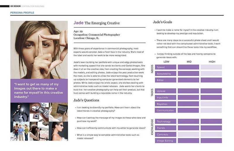
Here’s an example of a real persona:

What’s next?
This is where the rubber hits the road. Armed with your user personas, you will have a better understanding of your user. You can now start prototyping the User Flows, and you’ll do a much better job than before because you now have much more empathy for your users. This is the core of UX Design, and going through the above exercise will help you feel connected to them in a way that code and features cannot.
Next time, when you look at the list of possible features you can add to your product, first think of the persona you created, and think about which features enhance their experience and make them delightful. Having a persona will enable you not to get distracted by the implementation challenge, opportunity to use a shiny, new technology, your personal biases, or anything else that inevitably creeps into our decision-making as developers.
Think about your user at every step, like your product’s success depends on them.
Because it does.

Thanks for reading this quick guide. This was originally published as part of the UX Design course (it has real-world projects on these concepts!) on Commonlounge, a platform that has courses with small bite-sized lessons like these on topics ranging from Django to Machine Learning that deliver the most value for the time you put in.
You learn by working on real-world projects and getting feedback from industry mentors.
