The Design of Everyday Things
I finally got around to Don Norman’s masterpiece in the later half of 2017, and I must say that it deserves every bit of praise that you may have heard about it. I’m in fact slightly upset at myself for not reading it earlier, since it bring together so much of the modern design philosophy. If you have anything to do with building products for people, you must read it — more so if you’re not the one directly responsible for designing it.
Things that I remember the most about this book:
Knowledge in the Head and Knowledge in the World
We use things we already know and things that are present around the object to figure out how to go about using the thing we want to use. Some examples of things we already know: logical, cultural constraints, etc. Some examples of knowledge present in the world: mappings, physical constraints, affordances and signifiers etc.
Affordances and signifiers
Affordances refer to the perceived and actual properties of the thing — primarily those fundamental properties that determine just how the thing could possibly be used. Affordances provide strong clues to the operations of things.
Plates are for pushing. Handles are for pulling. Slots are for inserting things into. Balls are for throwing or bouncing. When affordances are taken advantage of, the user knows what to do just by looking: no picture, label, or instruction is needed.
Signifiers signal things, in particular what actions are possible and how they should be done. Signifiers must be perceivable, else they fail to function. Quick example: Links must be blue, or underlined to signify that the text is clickable.
Perceived affordances often act as signifiers, but they can be ambiguous.
Mappings
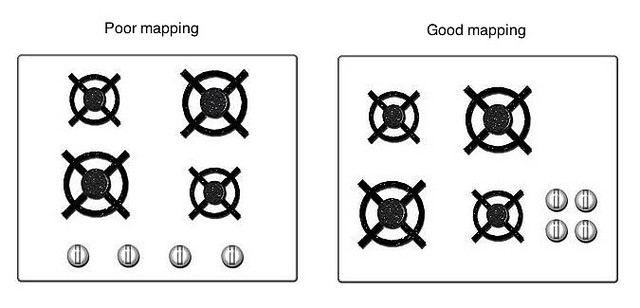
Mappings between controls and their actions can be enhanced through good spatial correlations or through temporal contiguities. Think of the stoves and their control mappings, and how a bad mapping is so much worse than a good one:
Conceptual Models
The design could convey all the information needed to construct a useful (but not necessarily accurate) conceptual model of the system. This makes the user feel more in control, leading to both better discoverability and evaluation of results.
Constraints, Discoverability and Feedback
Providing physical, logical, cultural and semantic constraints can guide actions and ease interpretations. The current state of the device, and the actions possible on it should be discoverable. The results of the actions you perform, and the resulting state of the system should be continously conveyed back to the user. After the action has been executed, the current state should be easy to determine — good feedback makes a system a lot more usable.
Types of errors: mistakes and slips
A mistake occurs when the wrong goal is established or the wrong plan is formed. Mistakes can be rule-based, knowledge-based or memory-lapses.
A slip occurs when you intend to do one action, but end up doing another. Slips could be action-based or memory-lapses.
I also particularly liked the Swiss Cheese model of accidents:
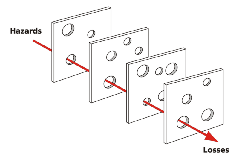
Don’t blame the user, it’s usually bad design.
Seven Stages of Action Cycle and three levels of behaviors
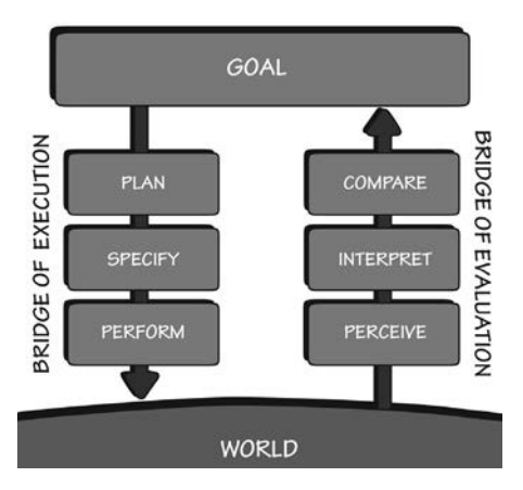
Think about how any action you perform takes place: You first form the goal in your mind, followed by planning what to do, specifying the exact steps and finally performing it. Once done, you perceive the effects of your action, interpret them and compare to what you expected to happen. Planning and comparing happen at a Reflective level, specifying and interpreting at a Behavioral level and finally, actual performance and Perceival take place at a Visceral level.
Design Thinking and Human-centered design
The double diamond model of design:
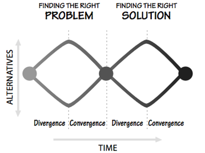
Before you start specifying the solution, specify the problem. Both the stages look like a diamond — divergence in the number of alternatives followed by convergence. And Human-centered design takes place within this double diamond diverge-converge process with four core activities: observe the users, generate ideas, prototype and test. And repeat.
Needless to say, a summary doesn’t do any justice to a book. Hopefully this post has given you a quick overview into what you’ll find inside this one, and maybe made you curious enough to read it if you haven’t already. Do not expect the book to give you the panacea to great design, but it’ll definitely make you aware of all the bad design around you — making you understand that as long as you’re involved in creating anything for others, you can make tangible contributions to improve the lives of your users.
This is #2 in a series of book reviews published weekly on this site.